Design That Demands Results
A Little About Us
Salazar Creative is a family-owned graphic design and marketing firm located in San Antonio, TX. We create brands and campaigns that create real results for clients. Our goal? Strategic and breakthrough creative that demands results. We hope you join the Salazar family!
Logo Design
Brand Identity
Ad Design
Brochures / Flyers / Posters
UI / App / Landing Pages
Billboards
Catalogs
Social Graphics
Menu Design
Product Packaging
Tradeshow Booths
And Everything in Between!
Latest Work
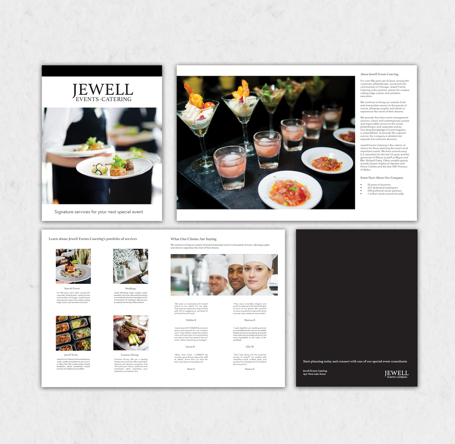
Brochure: Jewell Events Catering
Jewell Events Catering is the premier caterer for creative, cutting-edge cuisine and seamless execution.
The client was looking for an informational brochure to highlight their stunning event photography and promote their services to prospective clients.
The final brochure resulted in 4 pages of delicious imagery and content presented in a simplified and elegant way to match their brand. It highlights their services, testimonials from previous clients, and more. The client is excited to use this elegant piece to increase the appetite for their services.
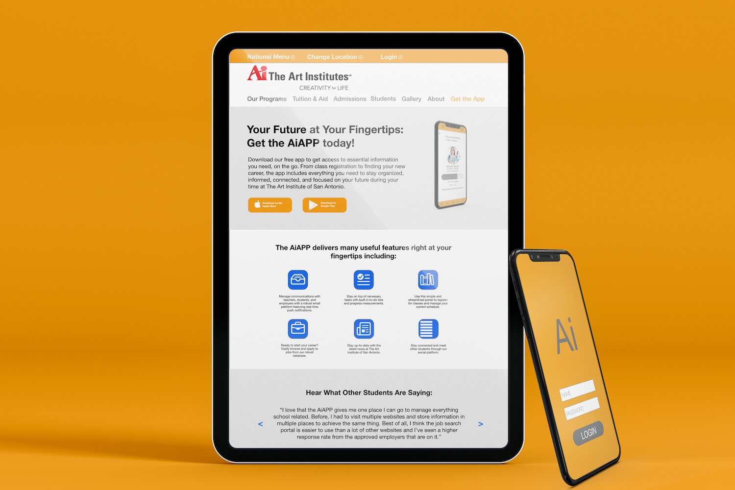
UI Design: Art Institute of San Antonio
The Art Institutes is a system of private schools throughout the United States offering programs in the fields of Design, Media Arts, Fashion, and Culinary Arts.
The client was looking for a new app for students to use to register for classes, get news or important updates, apply for jobs, and more.
The final design resulted in an easy-to-use and engaging app that makes content more easily digestible. With the limited time available to students, the design I created ensures the most important information is at their fingertips and eliminates other distractions. With a rapid adoption and high engagement seen in the app analytics, this design surely passed the test.
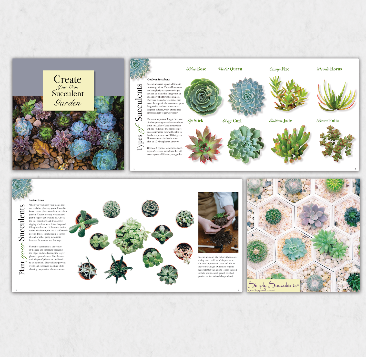
Brochure: Simply Succulents
Simply Succulents is a leading eCommerce store, offering an extensive line of hardy succulents, exotic succulents, topiaries (living garden art), cuttings and succulent plant collections.
The client was looking for an informational brochure that could educate their customers on how to use their products.
The final brochure resulted in 8 pages of striking imagery and informational content. The brochure features topics such as the types of succulents that are available, how to plant certain types of succulents, and more. The client is excited to use the stunning piece to help their business grow.
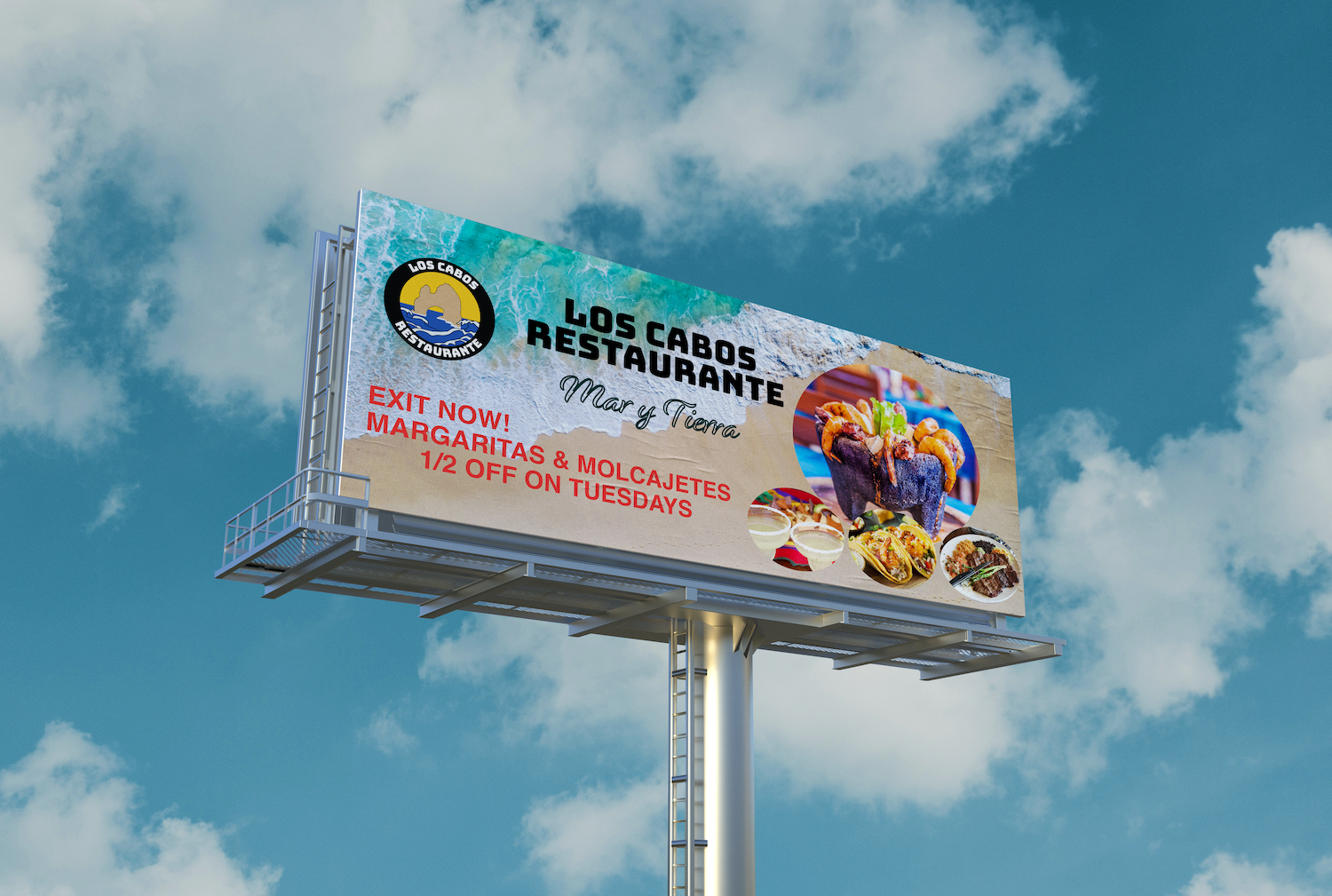
Logo and Brand Identity: Los Cabos Restaurante
Los Cabos Restaurante is a brand-new Mexican seafood restaurant in Hanover Park, IL.
The client was looking for a logo that featured the iconic Arch in Los Cabos, Mexico.
The final logo features bold black, orange, and blue gradient colors. The bold Los Cabos Restaurante font is paired perfectly with a soft script font. The new logo will be featured on all collateral including the menu, awning, billboard, uniforms, and more. With the new logo and brand identity the client is ready to swim with the sharks.
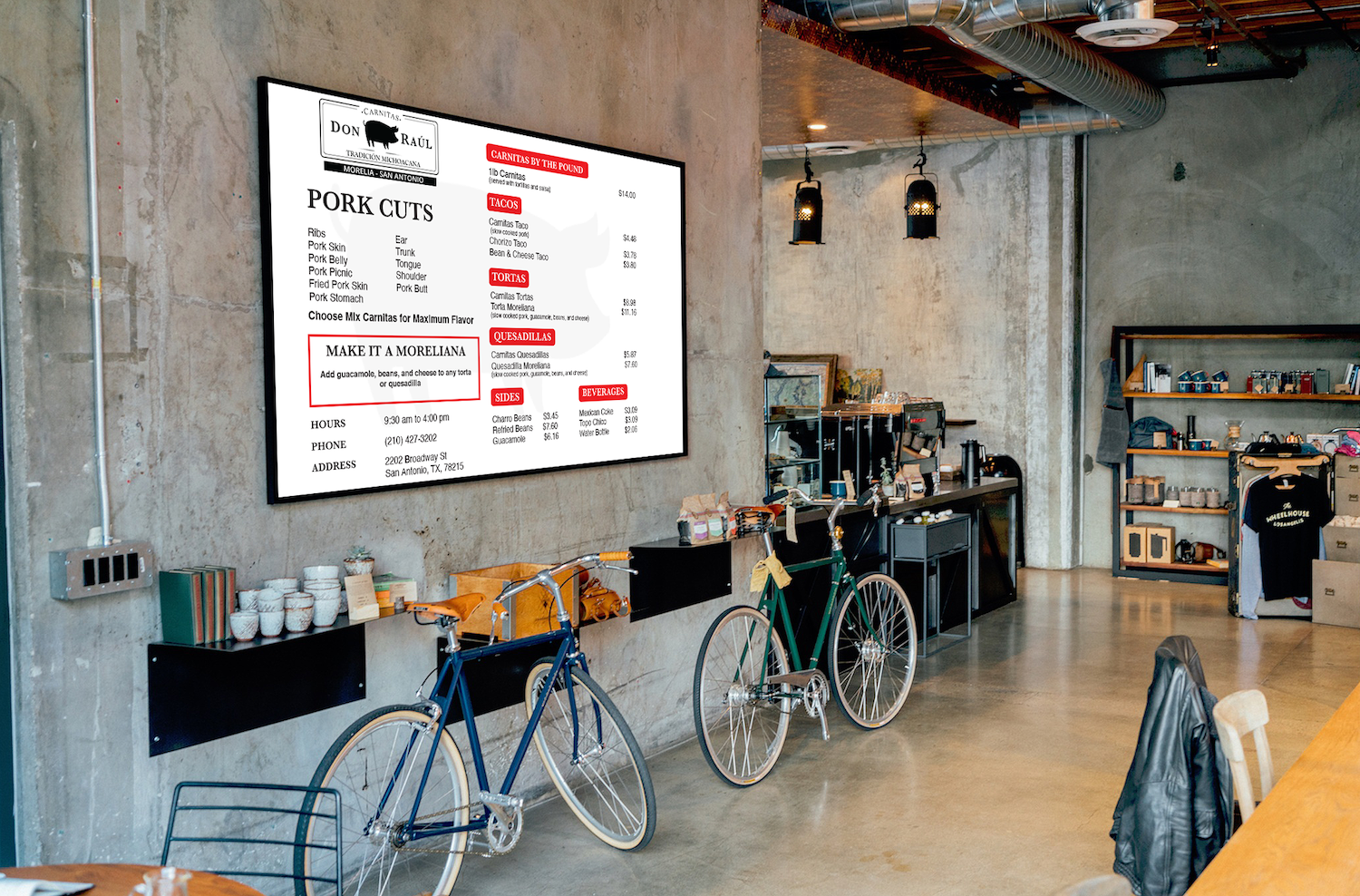
Menu Design: Carnitas Don Raúl
Carnitas Don Raúl, like many success stories, was born in the concept of the “street taco”, it was in 1991 and Don Raúl started with a position located at the Poza Rica Gas Station in the beautiful city of Morelia, Michoacán.
With soaring popularity after their appearance on Netflix’s Taco Chronicles, their San Antonio location was looking for a new menu design to replace their dated version.
The final menu resulted in a new, simplified 1-page design. Now, the star of the show – the carnitas – and the cuts of meat are front and center with the hierarchy I established. The condensed 1-page design allows for a better marketing piece for them. The client is ecstatic to sow up some additional orders.
It’s not who I am underneath, but what I do that defines me.
– Batman
It’s not who I am underneath, but what I do that defines me.
– Batman
